India - Startup Unicorn
Zenoti - B2B Business Management platform
About Zenoti
Zenoti is a technology product-building challenge to solve small, medium, and large-scale spa and saloon chains with managing their businesses operations seamlessly. www.zenoti.com
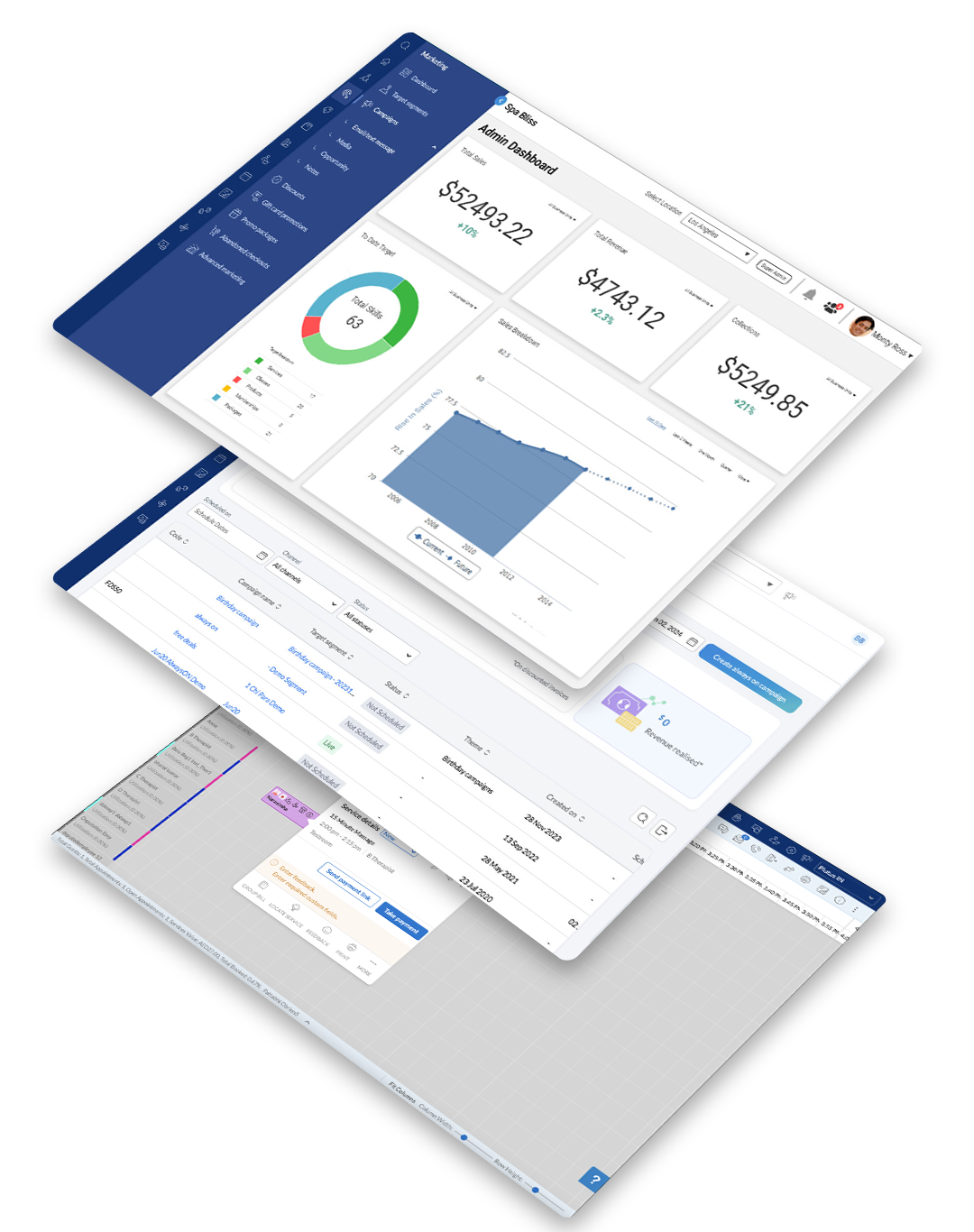
The platform's purpose: Help affiliate staff to analyze and manage their business, allowing users to book and manage their bookings seamlessly.
The Outcome
Soon after the launch, this app got market leader status and became a Unicorn startup within years of its operations.
I Designed a data driven platform enabling efficient real-time insights to tackle business operation challenges such as store management, managing bookings, invoicing, and others.
Results

30K +
Businesses
Trust
50+
Spread Across
Countries
93%
Satisfaction
Rate
64%
Prefer
App Bookings
NOTE
Shane Evans
Founder & President, Massage Heights"Heights anticipates doubling our size in the next several years, and it's really important for us to have a software platform that is scalable. Zenoti offers the most robust software to meet our growth needs. That's why we chose Zenoti over other vendors, and we've achieved a 58% growth in online bookings over a period of six months."
Problem Statement
Context
Currently market solutions provide a software solution for managing appointments, customer relationships, inventory, and more partly or separately. One of the critical features need is the online appointment booking system, which is used by clients of spas and salons to schedule their visits. Despite the functionality, some users find the booking process confusing or cumbersome, resulting in abandoned bookings and increased support inquiries.
User Problem
Customers of spas and salons using freeware booking system experience difficulty in selecting their desired service, stylist, and time slot in a seamless way. The current interface involves multiple steps, and users often feel overwhelmed, especially when navigating through different options like stylist preferences, location, and services. This leads to frustration, increased time spent on booking, and sometimes abandoning the process altogether.
Business Problem
The inefficiency in managing business with booking process negatively impacts conversion rates, resulting in a potential loss of revenue for spas and salons using the freeware's. Moreover, adding additional costs for maintaining customer support teams are spending considerable time addressing booking-related issues, further escalating operational costs.
Hypothesis
By simplifying and streamlining the booking flow—offering an intuitive design, reducing unnecessary steps, and providing clear instructions—Zenoti can create best user satisfaction, increase booking completion rates, and reduce the support burden.
Desired Outcome
- A significant reduction in the number of steps involved in booking.
- Improved user feedback and customer satisfaction scores.
- A measurable increase in the percentage of completed bookings.
- Decrease in support tickets related to booking difficulties.
Design Process
The strategy has been created based on a design thinking approach where we are paying attention to the introduction phase before starting our work to collect all the problems stakeholders see and users face. After designing another tasting phase was initiated to see if problems were solved effectively.

Research
Through an in-depth literature review and an extensive discovery phase of user research, which included user interviews. I learned that there is a need for a solution that provides centralized and reliable access to guest data, bookings and managing chain of stores.
User interview insights
-
Inconvenience
Users mentioned that they have to depend on multiple apps to get their business going, like inventory, billing, appointment schedule and maintenance, employee management, sales and marketing.
-
Uninformed about available inventory
90% of users expressed a desire to access inventory information prior to their customer visit to make informed decisions and potentially avoid unnecessary visits.
-
Unable to manage service bookings
yet they use different tools to get their job done, they are finding it hard to manage spa, saloon, classes and other vertical bookings for one to multiple (bulk) bookings.
-
Invoicing problems
Users are getting mixed up with invoicing as they are mostly doing manual sales as freeware does not provide complete billing capabilities.
Ideate
Understanding user needs
User interviews were essential to understanding the current workflow and what information was important at each stage.
When I'm evaluating
- I want to know the therapists persona details.
- I want to know what job therapists can perform on a daily basis.
- I want to know the customer's history of services and trends.
- I'm building a mental model and comparing it against similar cases.
When I'm deciding
- I feel confident about my decision.
- I want to know if the customer is responsive to follow-up questions.
- I want to see similar cases, and make decisions accordingly.
- I want others in the decision making team to understand my decision making.
User Profiles
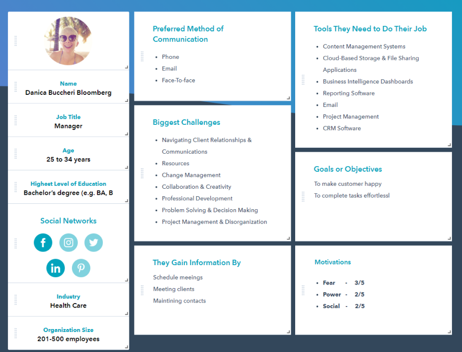
Danica is the people management person. She has many years of experience in this industry and has worked in multiple roles throughout her career, like front office, admin, back office, supervisor and currently as a manager.
Her persona assessment here is for a manager who works on a shift and maintains her store.
Information Arthitecture
For this project in building information architecture, this was built on top of the basic site mapping and added to both child pages and actions. The addition of number values denotes the priority of pages in the information hierarchy rather than leaning on colors.
Design & Iterate
Affinity Mapping
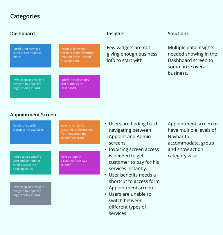
With each iteration, I synthesized feedback by plotting and categorizing issues on an affinity map. This helped me make design improvements based on user patterns and key pain points.
Gathering details from mapping user needs, here are some of the key insights listed that played a critical role of solving this problem.
Iterative Learnings
Wireframe designs were iterated upon through usability testing and client feedback, with each iteration improving on design choices and visual hierarchy.
Testing was conducted remotely with local DC participants over Zoom. I was able to observe participants interactions and had them “think aloud” as they navigated through a prototype.
Design
Sketches
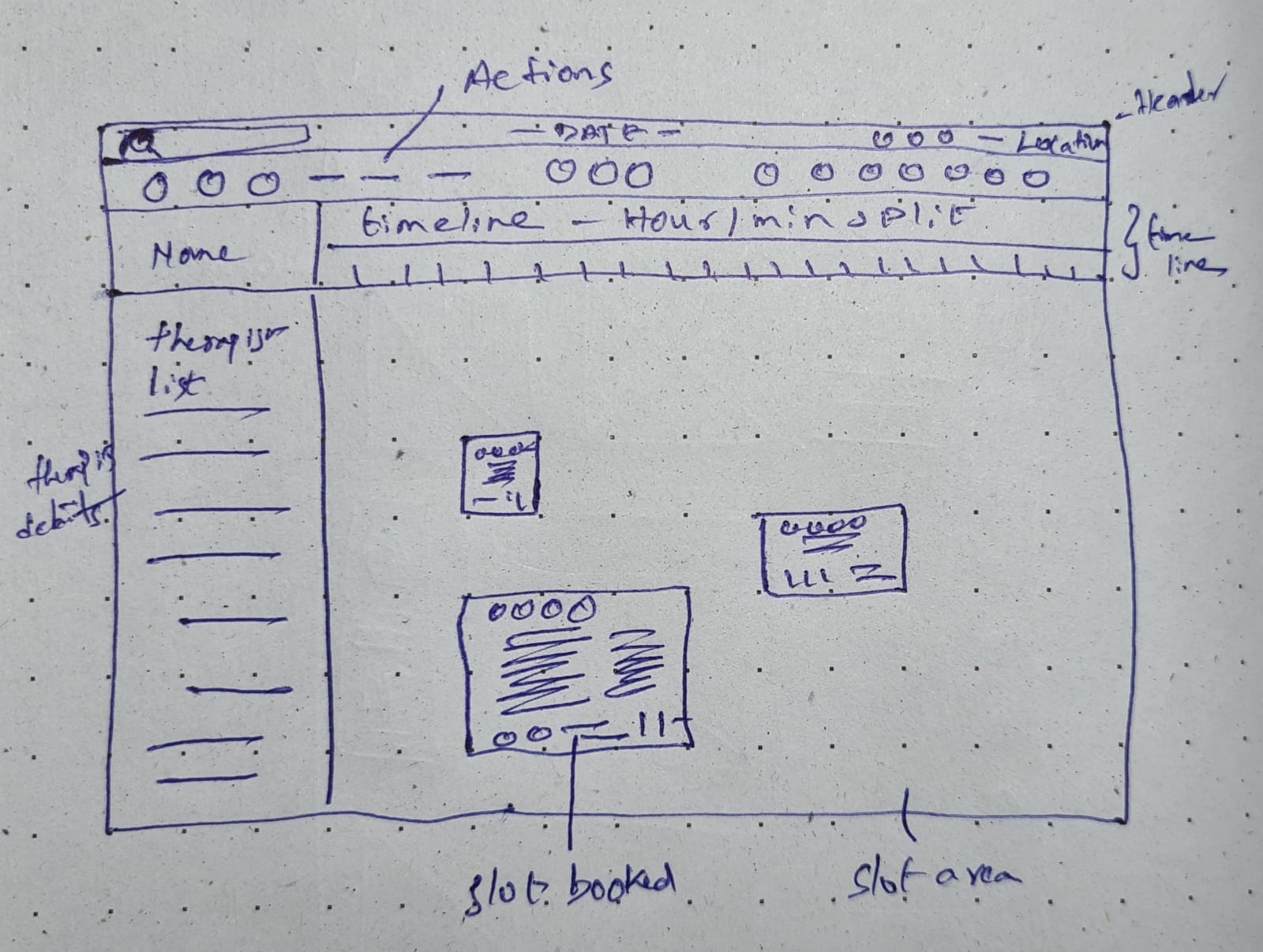
The design phase focused on intuitive interface design, seamless navigation, and thoughtful incorporation of user feedback. I initiated the design process with the creation of paper sketch wireframes, which were then transformed into low-fidelity prototypes that helped validate the concept and source the information architecture.

Low & Hi-Fidelity Wireframes
For this project in building information architecture, this was built on top of the basic site mapping and added of both child pages and actions. The addition of number values denotes the priority of pages in the information hierarchy rather than leaning on colors.
Here are the final design mockup's after iterations.


Style Guide
Brand design was done concurrently with wireframe iteration. I gathered logo and brand requirements from the client, and sketched out a number of concepts. I went through two feedback and iteration sessions before deciding on a final logo design.

Final Designs
Brand Identity
Branding Brand design was done concurrently with wireframe iteration. I gathered logo and brand requirement, and sketched out a number of concepts. I went through two feedback and iteration sessions before deciding on a final logo design.
Logo & Imegary
Logo
Imagary

Hi-Fidelity Design's
After the results of the usability test, I redesigned the screens with a focus on these factors:
1. Reduce the information overload by simplifying the information into manageable chunks.
2. Improved visual clarity, ensuring users could easily understand and navigate through the
interface.
3. Optimize the app for discoverability to ensure users can easily find and explore its features.
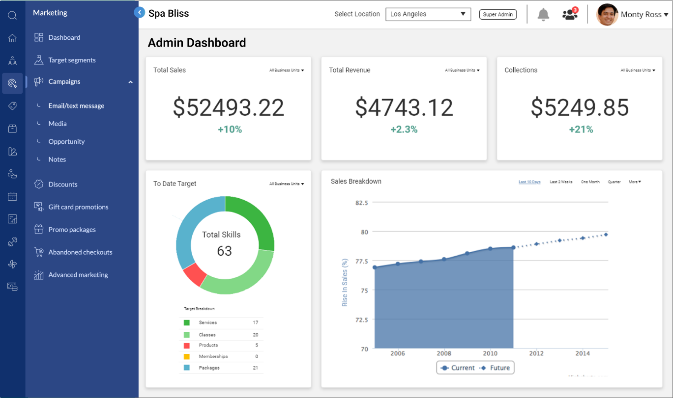
Admin Dashboard
Users now effortlessly access business metrics, planning their businesses effectively.

Marketing Dashboard
Users can track, manage their marketing tools from the marketing home page and boost their reach.

Campaign Dashboard
Users can now schedule, track, and enable custom campaigns to improve their marketing activities effectively.

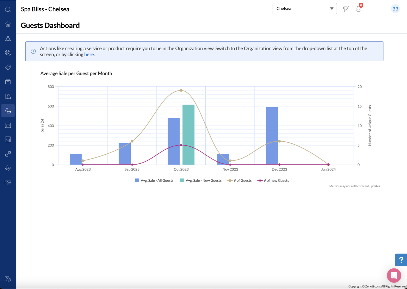
Guest Dashboard
Managing guests and end-users was always a problem. With the guest dashboard, users are able to see detailed information and manage guest bookings.
Appointment Scheduler
By using the appontment scheuler, users like therapists, front-desk staff and other can book single, bulk appointments seamlessly as the app always shows live information on bookings.

Zenoti Highlights