MBS - Experts: A Trade Assignment Platform
Redesign from legacy system - design challenge
India - Fintech/Market leader
The MBS Expert® is an efficient enterprise mortgage-backed securities system for front and middle-office
functions. It is the most widely used post-trade mortgage-backed securities system that supports a large
volume of
data.
www.broadridge.com
Monthly Visits
Locations
Annual Revenue
The outcome
Let's check the Product Video of the application that covers the product capabilities.
View Product VideoHere’s the impact
of the design changes
Monthly Visits
Locations
What made it work:
The user-friendly and intuitive design increased customer satisfaction and ease of use online. Simplified the trade process, ensured a secure transaction flow, and proved efficiency by conversion metrics.
Discover
What is Mortgage backed securities?
A mortgage-backed security (MBS) is a type of asset-backed security (an "instrument") which is secured by a mortgage or collection of mortgages. The mortgages are aggregated and sold to a group of individuals (a government agency or investment bank) that securitizes, or packages, the loans together into a security that investors can buy.
Bonds securitizing mortgages are usually treated as a separate class, termed residential;[1] another class is commercial, depending on whether the underlying asset is mortgages owned by borrowers or assets for commercial purposes ranging from office space to multi-dwelling buildings. Here is an illustration below.

Lets now start understanding the Broadridge MBS expert as a market leader product managing the mortgages and being a legacy product, understand need for change, process and so on.
The Problem
Users are finding it hard to use the existing system as they have to use multiple screens to complete one trade. The UI used in the existing system is not user-friendly and you have to train the users for a long time to make use of it. The other problem seems to be that the flows are not consistent overall.

Below are some of the problems.
- The Users has to continuously monitor multiple screens for related information to complete a trade.
- The current application offers multiple environments to open and access different screens at the same time, which causes a lot of stress and load on the human eye while tracking px by px and screen by screen.
- The cognitive load overall is increasing when performing a task
- The application is also hard to navigate back and forth, switching between multiple screens
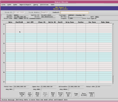
Here is a snapshot of the existing legacy application screen showing trade search details with a lot of information. The existing application views open as a separate application window.
Design Process
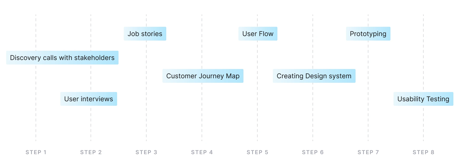
My process at Broadridge is based on the Double Diamond Theory and the lean UX process. I aim to incorporate the key phases of discovery, definition, ideation and implementation in all of our projects.
Research
Along with these observations, I also analyzed the user flows of different B2C apps in the market, like movie ticket bookings, food delivery, and next day grocery deliveries.
User Interview Insights
-
Timelines
For processing trades, users have to consult or follow a checklist of 500 odd rules. This is making them frustrated at times.
-
Processing bulk trades
As in the existing system or app, the capability was to implement one trade at a time. This could be corrected by new user-flows that allow bulk bookings.
-
Trade Allocation
In Trade Allocation screens/flow, users felt frustrated in entering a lot of fields. This can be solved by implementing the best design.
Redefining Layout
The primary problem observed during the research was that the process flow has different applications to run to complete a trade. This problem could be solved by applying UCD, where the right IA can be structured so that menu items can be organized in groups.
Ideate
Understanding user needs
Design workshops and other research methods were used to understand users and the problems they are facing currently.
When I'm Evaluating
- I want to know what services the customer is rebooking each time.
- I want to know what addon's customers are adding along with a service.
- I want to know how many do not book services, not more than their membership points.
- I want to know how many customers choose their therapist before or at the time of booking.
- I want to know if bookings created by customers are different from their base locations?
- How do advance customers book their service? less than 24 hours?
When I'm Deciding
- I feel confident about my decision making
- I see customers feel confident enough to pay after taking their service.
- I want to know if the customer is responsive to follow-up questions.
- I want to see similar cases, and make decisions accordingly.
- I want others in the decision-making team to understand my decision making.
- I'm building a mental model and comparing it against similar cases.
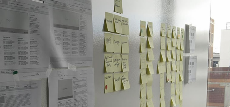
Refinement
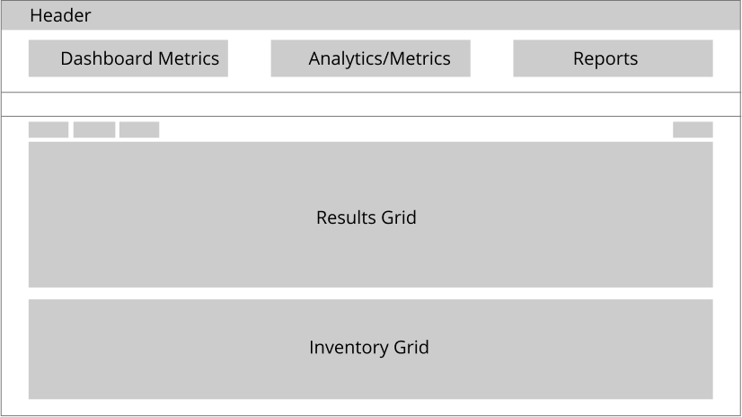
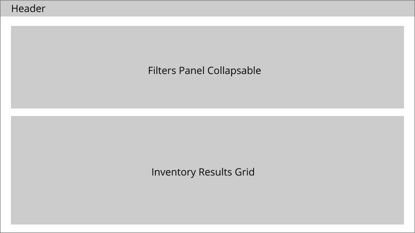
Using a paper prototype, I drew and tested the initial business flow for the app internally. This highlighted the lack of visibility of the trades and transactions. Then, the flows were streamlined accordingly by the UCD process providing functionality to make minor edits. I proposed few layout options for these to get streamlined.
Defining the main flow of the trade process with all variables was the hardest. It had many steps, and the team could almost never agree on the amount of flexibility provided to the user. I explored a number of flows to establish the final layout of the home screen and some other key screens.
User Profiles
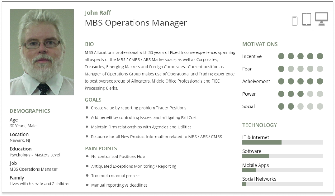
John is the system user and operates the system on a shift basis. John has many years of experience in this industry and has worked in multiple roles throughout his career time.
There are eight user profiles I have identified where the John profile was relevant to all of the roles in the personas.
John's persona assessment here is for a allocation manager who works on shift and completes his assigned trades for the day.
User Goals, Tasks & Actions
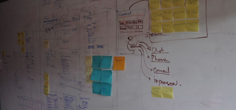
Based on the key insights gathered from the user interviews, I have determined user stories, user goals. From there, I was able to build the corresponding user flows, illustrating the process for completing a task and reaching the goal.

Design explorations started early on in the project in order to work out user flows. Initial exploration was chaotic and stuffed with features on the home page. With every review with the PM or manager, I refined the views and dissolved features in subsequent steps to create a proper booking flow. By doing this, I had a clear direction for the wireframes and flow.
Information Arthitecture
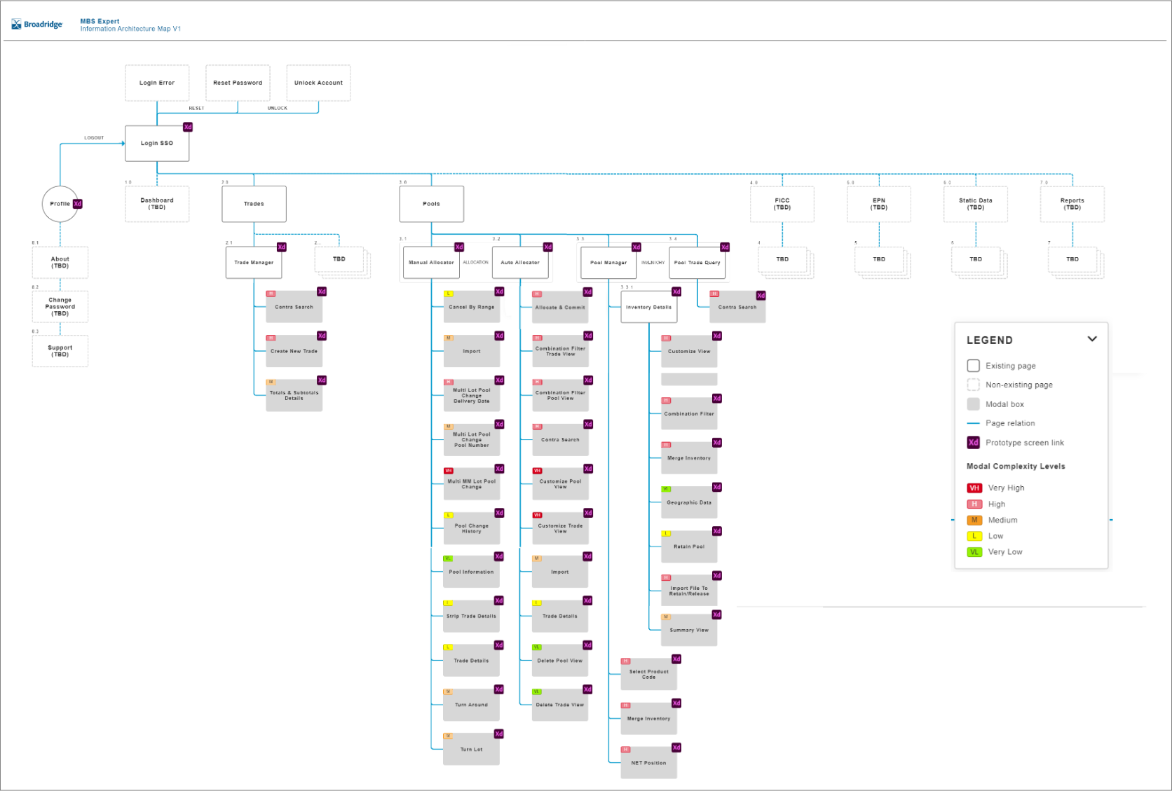
Gathering all relevant data and building an information architecture to create the finalized idea to the end product. The below diagram shows IA created for the main application, showing the dashboard approach as a landing page, and can be navigated to below linked screens.
Design
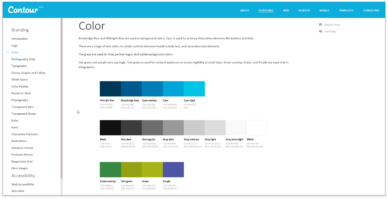
This project was the first to adopt Contour, a design system created for all product needs. Establishing a global design framework presents an ideal opportunity where users have to spend no extra time on UX, micro-interactions and can make use of reusable components as well as typography, colors and layout.
Taking the product from idea to reality in 4 short months, I designed the app keeping in mind that members can utilize their services seamlessly at any retreat across the country. The app allows complete flexibility for the user to select aspects of their next appointment. Choosing from a number of services with a desired therapist for each and a range of add-ons to select from, users can choose an appointment time up to 3 months in advance.
Deliver
After finalizing the UX flows and design features with the clients, the developers, and the project management team, I worked on the visual designs. I created icon libraries, color palettes, buttons, etc., along with providing all the required assets to the developers for production.
Low & Hi-Fidelity Wireframes
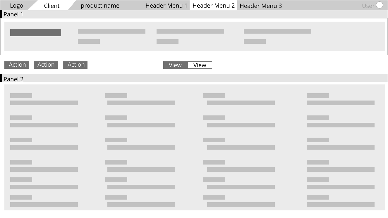
Defined user flows and started working on creating wireframes and designs based on the effort made. Below are the images and mockups designed to create the structure and flow of the design.
Iterative Learnings
Wireframe designs were iterated upon through usability testing and client feedback, with each iteration improving on design choices and visual hierarchy.
Testing was conducted remotely with local DC participants over Zoom. I was able to observe participants’ interactions and have them “think aloud” as they navigated through a prototype.
Style Guide
Brand design was done concurrently with the wireframe iteration. I gathered logo and brand requirements from the client, and sketched out a number of concepts. I went through several feedback and iteration sessions before deciding on a final layout design.
Final Designs
Hi-Fidelity Design's
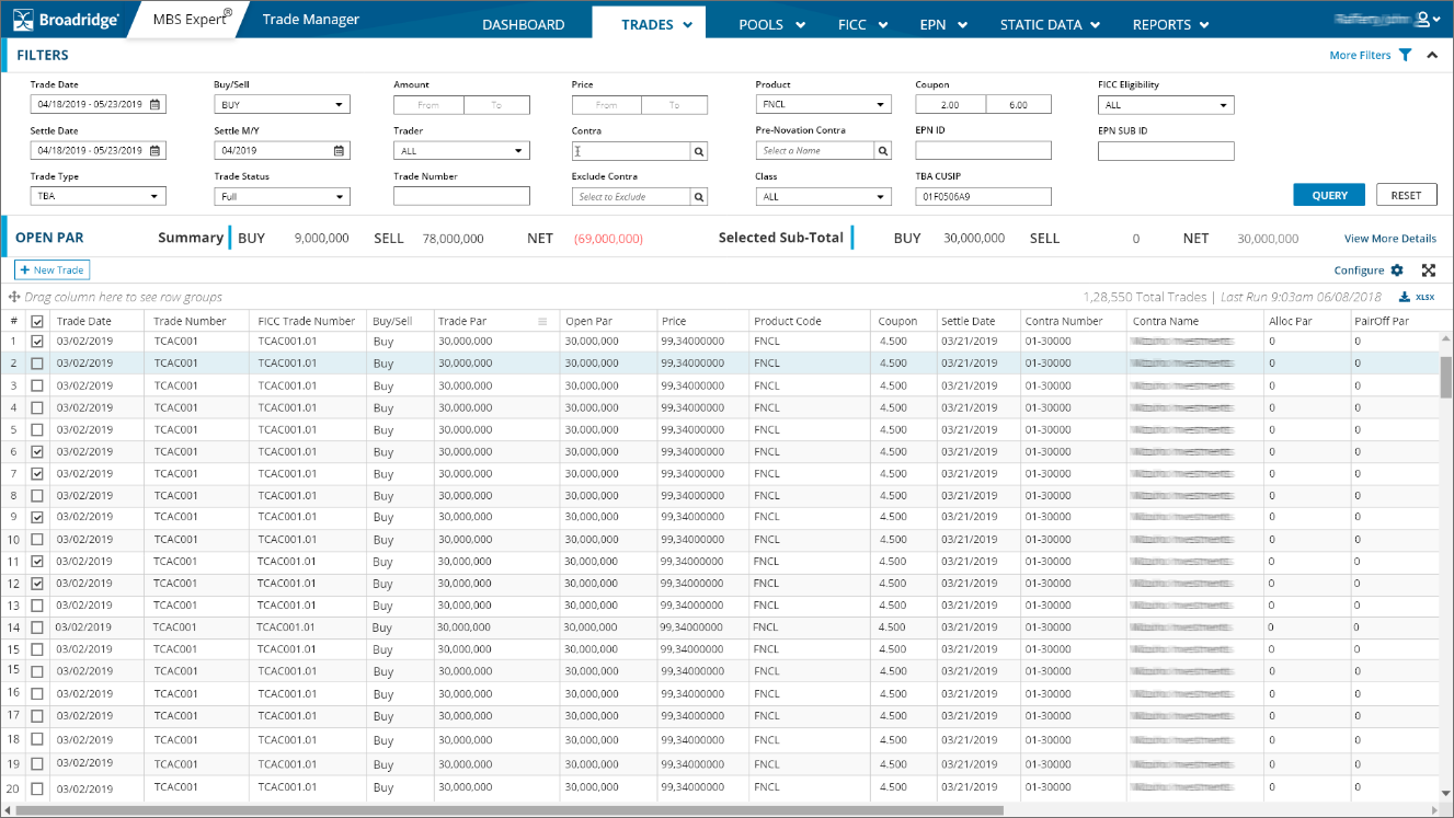
The platform uses a 12-column responsive grid with adaptive elements and was designed to surface necessary information and highlight the next actions, at each stage of the flow to improve overall efficiency.
After the results of the usability test, I redesigned the screens with a focus on these factors:
1. Reduce the information overload by simplifying the information into manageable chunks
2. Improved visual clarity, ensuring users could easily understand and navigate through the
interface
3. Optimize the app for discoverability to ensure users can easily find and explore its features.

Design Transformation
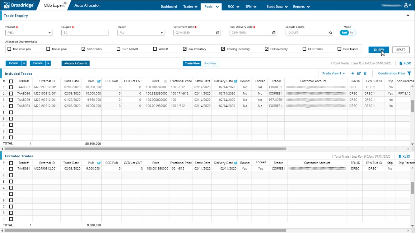
Transformed from an old 90's application to a new, fresh, quick and easy usable solution that communicates and makes the user's job quick.
The usable aspects of showing appropriate information needed, like cash balances, customer information, and results, help users quickly check balances before confirming a transaction. The use of colors and flat UI makes it simple to use.
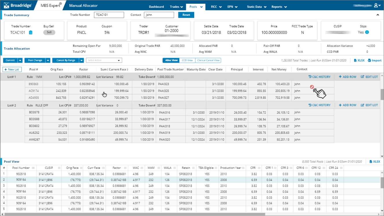
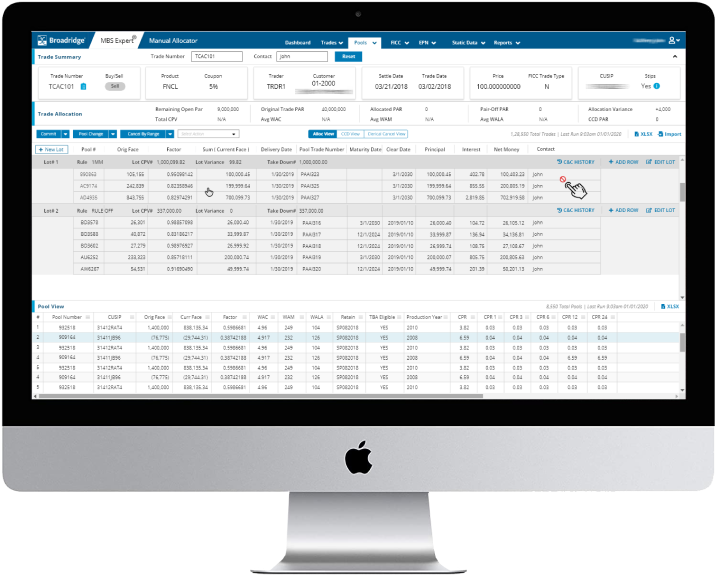
The allocation screen is the priority item for the application, as the majority of allocation is done here. By enabling the totals and necessary functionality on this screen, you can see that the user never misses the context of the task he is doing.
Conclusion
Result & Takeaway's
This project proves to be an excellent workout on design, after working for over one year, making the product redesigned and easy to use, The feedback after testing proves it all. The number of usability issues has been reduced to minimum and with this new design, users ware happy with the app.
The Change
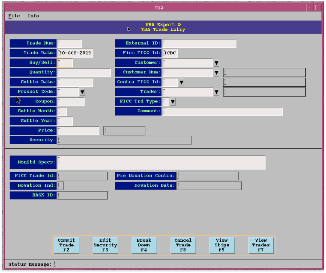
The below images show old and new designs. The idea here was to show the impact created by applying UCD. The new template structure was well received by the users. Now, they can make comparisons in one place and complete their trades faster.
Trade Entry Screen


Allocation Screen
